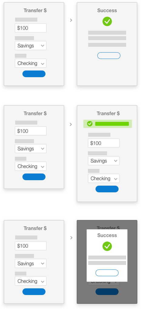
Back
CaryEvans   |   Axos Bank


Our Design Process Case Study: Confirmations Gallery of Work


About Axos Bank
Axos was founded in 2000 and is a publicly-traded internet bank (NYSE: AX) with approximately $10 Billion in assets.

As the VP of Customer Experience, I had the opportunity to manage the design and front-end development team and define what customer experience meant inside the company. I joined at a time when Axos had just decided that it would build its own banking platform instead of buying off-the-shelf software; a decision that would pay dividends later.


Our Design Process

1. Know your customer - In banking, there are Know Your Customer (KYC) laws that are in place to help the government fight laundering and other financial crimes. We needed to go several steps deeper to build products they love.

I implemented a user-centered design process at Axos that involved customers at different points. I organized events to get customers in the bank and discussing topics with the leadership staff and designers.

We used this feedback to inform designs and understand what is important. For example, in one session, customers stressed that there is a lot of news on hacking and they are concerned with security, identity theft, and ideas to prevent it. This feedback accelerated our biometric authentication project and a notification engine update.


2. Kick-off meetings - New features and functionality launched with a required kick-off meeting. All people involved would get together in a room to review the opportunities that were being addressed. We incorporated this step in the process after experiencing churn with a couple of projects. The right people were not in the room at the beginning of the project which would later cause rework of the project. We learned that this was a great way to get all the ideas out on the table early on.

3. Design and iterate - Once the project was kicked-off, designers would work through the goals of the project adhering to our design system. We had weekly meetings on Thursday to review the progress of the design and discuss alternatives. Additional reviews were scheduled as necessary.

4. Customer Feedback - All major features received customer testing and an accessibility audit to ensure we had an inclusive website and complied with WCAG 2.0 AA for accessibility. My goal was to get everyone on my team to run at least one series of tests from start to finish. I provided training, templates, and coaching along the way. This was both to improve the product and professional development for my staff. After testing, the feedback was compiled, presented to both the design staff and the project team including senior leaders.

In addition to overseeing multiple mobile and web apps, I managed the re-branding and re-platforming of our customer-facing website. This major project included managing and tracking approximately 300 pages from the old brand, Bank of Internet, to the new name, Axos Bank. Copious amounts of coordination with business units was paramount to ensure that there were no major glitches.

The Result
Our process and efforts showed results in many different ways, the most notable was it's contribution to winning deals. Despite not being the highest bidder in the multi-million dollar acquisition of Nationwide Insurance’s banking division, Axos was still able to secure the deal. When asked why, they cited that that one of the key reasons being the design and polish of our applications. This was a huge compliment and win for the design team that had poured blood, sweat, and tears into the product.


Confirmation Screens

Overview

When money is moved how do customers want confirmation? Peer-to-peer payments, paying bills, and transfering money between accounts are all core functions of a bank’s application that require a confirmation message.

In the physical world, this is done through a physical object, the receipt. Receipts document that money has changes hands. In the digital world, receipts can take on many forms.

What is the best method of confirming that action that makes customers feel confident and trust the application? That is what we set out to find out...


What we tested

We had 3 different confirmations methods that we tested:

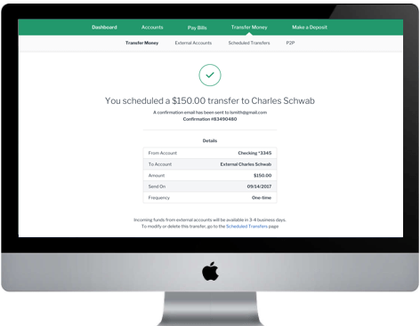
  1. Confirmation page – A separate page with details about the transaction.
  2. Inline confirmation – A simple message on the page that is being interacted with.
  3. Modal confirmation – A temporary dialogue box that is overplayed above the screen.


How we tested

We ran a research study with 6 participants. This was a within-subject test where each subject was shown 3 designs. The order that they were shown them was randomized between subjects to reduce any ordering bias.

Each person was given the task to transfer $100 from their savings account into their checking account. They performed this task 3 times with each version of the task having a different confirmation method. After the task, they were asked to rank their confidence. At the end of the test, all 3 designs were shown in paper format and users were asked to rank their preference.

Unanimous Results

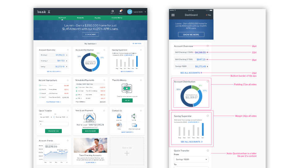
This test arose because we were not consistent in how how we were handling confirmations after moving money. Aas a design team, we discussed the merits of each of the designs and which one we felt was best before we tested.

The results were unanimous! Because of the importance of transferring money, all 6 customers preferred the separate page confirmation screen. Since it is their own money, they want to be crystal clear about what is going on. It is a familiar design pattern that signifies the end of a transaction.

Based on this feedback we created a single pattern for our design system and updated all instances in both the mobile and web applications.


Gallery of Work

Work that we did for Axos Bank.


© Cary Evans 2024